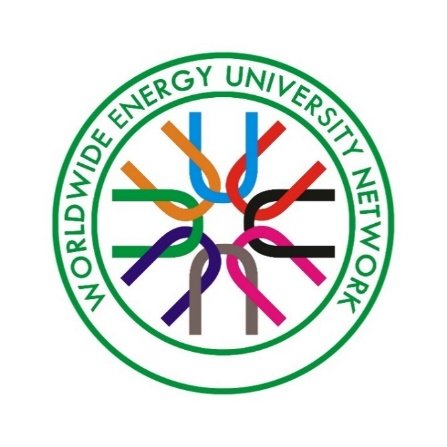
On April 23, 2019, the logo of the Worldwide Energy University Network was officially published. 对照阅读
The main body of the logo is round in appearance. The full name is arranged in a semi-circular way, which symbolizes the global network of energy universities. The central design is comprised of 8 U-letters, which represents both universities and the meaning of united. The pattern uses eight different colors to represent the coexistence of multiple energy sources in the world. Eight U-letters are linked together to indicate the close cooperation between member universities. The word U is outward, indicating the nature of an open alliance. The pattern takes green as the main tone, indicating the trend of energy development towards green. 相关文章
The design proposal of WEUN LOGO has been solicited since September last year from various aspects. The designer of the finalized logo is Ms. Xia Dongmei, from Karamay Campus, China University of Petroleum (Beijing). 继续了解
(Edited by Lu Ji)

